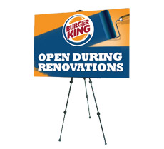
 Mini-billboards are a great way to advertise your business, but only if people pay attention to them. Among all the aspects of mini-billboard design, choosing your colours is one of the most important. After all, the first thing most people notice is the colour of your sign, so you need to make sure it stands out. You only get a few seconds for people passing by to take notice of your billboard, so use these tips to help you choose the best colours for your mini-billboards.
Consider your company colours
This is one of the most common ways to choose your colours, particularly if you’re trying to make your brand known. The only exception to this is if your colours aren’t particularly suited to billboard advertising, like pale or neutral colours, which could blend in with the surrounding area and cause your mini-billboard to be completely overlooked.
Go bright and bold
The brighter, the better, when it comes to choosing billboard colours. With limited space and only a short amount of time to attract people’s attention, you need to choose bold colours that stand out and demand to be seen. Highly contrasting colours work well, but keep your fonts in mind, too. You need to make sure that your text can be seen against the background of your mini-billboard, so choose your font colours wisely.
Use psychology
The psychology of colours can be powerful in marketing. For example, red creates a sense of urgency, while blue tends to symbolize trust and peace. Bright colours like oranges and yellows create a sense of cheer, while black symbolizes power and strength. Choose the right colour to match your message, and people will take notice.
Take the time to consider your colours when designing your mini-billboard and make sure that all eyes are on your advertising.
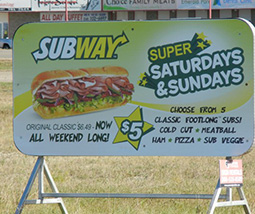
 When it comes to

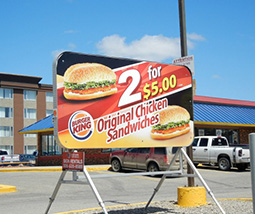

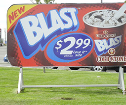


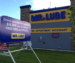 When it comes to billboards, size matters, but not necessarily in the way that you might think. Most people think of full-size, traditional billboards when the subject of advertising arises, but mini-billboards can have just as much bang-for-your-buck as their larger counterparts. Here are some advantages these little marketing dynamos have over traditional billboards.

 There are a lot of myths and misconceptions about outdoor advertising. The truth is, a lot has changed in the past few years, but outdoor ads are as effective as they’ve ever been, only a lot more versatile. Here are a few myths about